Farmdrop - Hublet Redesign
Hublet is the main app used by Farmdrop Hubbers. Hublet allows them to check in produce received by our producers and then pick & pack the items for customer orders among many other functions.
The Problem
Though the Hublet was functional and did what was required of it, one of the biggest issues Farmdrop has in relation to customer orders is order accuracy and that was directly related to the way ‘pick & pack’ was on Hublet.
One way we wanted help improve order accuracy was to introduce the scanning of products and the customer crate they go into. This meant that the Hublet UI needed an overhaul to incorporate the scanning and at the same time we decided to give it a newer look and feel.
Component Library
Another part of the Hublet redesign task was to come up with a component library to be used not only for the hublet app but also for any other android apps we may redesign in the future.
Because I had already designed the web design system, I had a good platform to begin with, that being said I still wanted the android side to have its own identity. Therefore the only things taken form the web design system were the colours and iconography.
Old Pick & Pack
New Pick & Pack
As mentioned, one of the biggest problems Farmdrop faced was customer order accuracy and this was mainly down to the way the old Pick & pack functioned.
The 3x3 grid shown on both versions represents the 9 customer crates the user has in front of them, the sidebar shows the product they need to be packing and the customer crates have 3 different states; active, completed and pending.
The old design shows all the customer crates the product in the sidebar needs to go into at the same time, when the user find the correct product they need to put it into the correct crate and press ‘ok’, upon doing so the next crate is highlighted and so on until that particular is no longer required. When this happens the next product is shown and then the process is repeated.
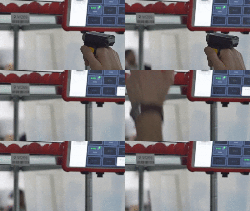
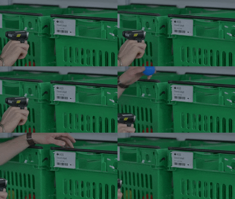
The biggest functional change from old to new is the introduction of scanning instructions shown above the 3x3 grid. The user is required to go to the product location like before but are now required to scan the location so the app can confirm whether or not this is indeed the correct product. If the correct location is scanned the app reveals the customer crate the product is required to go into. The user is also required to scan the customer crate they put the product into so the app can confirm if this is all correct.
Scan product location
Product location is currently highlighted. It shows the location number and also the of products to collect in the blue circle.
Scan Customer crate
If the correct product location is scanned, the instruction goes to its completed state and the customer crate is activated.
More scan states
Other Functionality
Do you have modal
This modals appears when more than 1 item is required in the customer crate. It requires the user to double check that they have the correct number of items and then scan the customer crate again
Pack History
This function is user activated. It allows them to see the products they have already packed along with future products
Trolley Scanning
This function happens at the very beginning, it requires the user to scan all the customer crates in a particular order to ensure that they are in the correct order.
Other Screens
Scanners in action
What was the impact?
We have been monitoring our accuracy levels before and after the release. The total item accuracy started at 99.5% before we introduced the scanners. The target was set at 99.7%. When we released early April the accuracy improved to around 99.75%.


