Wellcome’s Funding Platform
Background
Wellcome improves health for everyone by funding research, leading policy and advocacy campaigns, and building global partnerships.
It currently funds research through the outgoing Grant Tracker, which needs more than a lick of paint. It could be clearer and easier to navigate, and the user experience leaves much to be desired, which is why Wellcome wanted to build a new, more accessible platform.
We create an inclusive, approachable, and efficient funding experience for everyone.
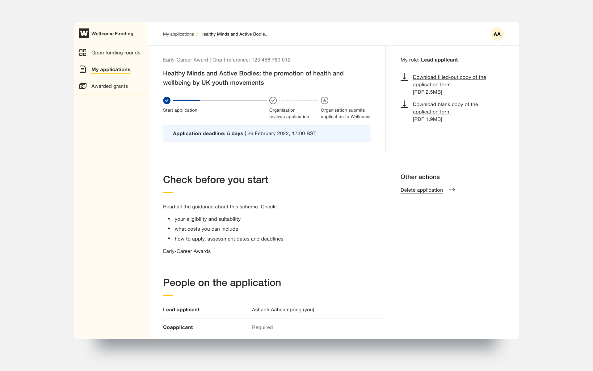
Wellcome's all-new Funding Platform is designed with inclusivity and accessibility at its core. I was predominately responsible for the product's visual design, ensuring it met user needs, business needs and technical constraints.
My first goal was to develop the product's visual identity; we wanted something that would reflect the wellcome.org public-facing website whilst still having its own identity and personality - siblings, not twins.
Exploration


Final Design alongside wellcome.org


The resulting design was a simple and focused product, incorporating the wellcome.org colour palette and typography, along with taking style cues from the global navigation.
Accessible forms
Now, creating this new product was essential to address the shortcomings of the outgoing Grant Tracker. The most significant improvement was to the application forms, which were clunky, difficult to understand, navigate and complete - evidenced by the high number of queries received by the Wellcome help desk, and the low ratio of started vs completed applications. This new product simplifies the form process and makes it easier to understand, navigate and complete.
Grant Tracker
Funding Platform
The redesigned form pages are far easier for all users to understand and fill in correctly. Crucial help text is no longer hidden behind tooltips which are also an accessibility nightmare; this was especially an issue for keyboard-only users and users who needed to rely on screen readers.
Forms also autosave now, meaning users no longer need to worry about accidentally losing crucial work or manually saving as they go. This, combined with a clear visual hierarchy and properly distinguishing sections and actions required by the user, help reduce cognitive load.
The single most considerable improvement to forms comes in the budget section, where users are required to give a total cost breakdown of their research, ranging from salaries to the cost of equipment. In Grant Tracker, the user is given free text fields to input this information, with no clear guidance on formatting or level of detail needed. The redesign removes this uncertainty and provides the user with editable tables, clearly stating what information is required and in what format.
Budget pages
Budget page on Grant Tracker
Form navigation
Form navigation was another area identified for improvement. Users are given a clear breakdown of all the sections within the form at a glance, along with statuses for all sections and an overall progress bar letting the user know exactly how much progress they are making with their application in real-time.
Form navigation
Form navigation ticks
All-new global navigation
The new global navigation sidebar, coupled with the breadcrumbs in the top bar, now makes it much easier for users to get around the product and also gives them a better overview of the hierarchy of pages.
Following a similar pattern set by wellcome.org, links are bolded to indicate the current page and hover states for inactive links. Users can also hide the navigation if they choose to, giving them a more focused space to do their work.
Comprehensive system feedback
One area of improvement I am particularly proud of is the new system feedback and notifications I have designed. Users are always kept in the as to what the product is doing, such as loading spinners. They can also see confirmations of any actions they perform, such as inviting participants to their application. Statuses are used throughout the product, both for entire applications and individual sections within the form, letting the user know at a glance if any feedback has been left on their application or how many more sections they need to fill in before submitting their application. Banners are also used to indicate many different things, such as letting users know if a page is locked and why.
Invite participant interaction
Pange banner
One area of improvement I have yet to mention, which ties some of the improvements already mentioned, is the interaction design and animations used within the product. As you may have seen from some examples above, the new Funding Platform is fluid and responds smoothly to user input. Closing the global navigation isn't instant and jarring, but a smooth transition where the sidebar disappears and the page content expands to use the screen better.
Animations have been implemented not only for aesthetic reasons, but also to bring functional improvements. Elements come to life as they transition from inactive to hover states, providing a visual cue to users that they can be interacted with. Additionally, page banners are not loaded until after the user has landed on the page, improving visibility and ensuring that important information is not overlooked.
The Funding Platform is due to be released in March 2023 and is currently undergoing production testing. Over the past two years, we have tested and iterated multiple journeys using prototypes I have built myself and prototypes created by our developers.

